Site Navigation
Navigation is critical to the usability of a website. Navigation should be clear, concise and well organized.
Need help organizing your website's navigation? We are here to help! It's easy to submit a help request here: Please include as much information as possible when submitting the request. Visit help.uark.edu and create a ticket.
Top Navigation
Top navigation is ONLY for department level navigation. There should be no global college navigation, except for on the main college site.
Two options for structure:
Option 1
Full width home page and secondary full width landing pages (top nav content) leading to tertiary 2 column pages with left navigation (items in your left nav should be what you used in your dropdown menu previously).
To view the live site, please visit armyrotc.uark.edu
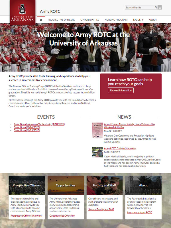
Full width home page
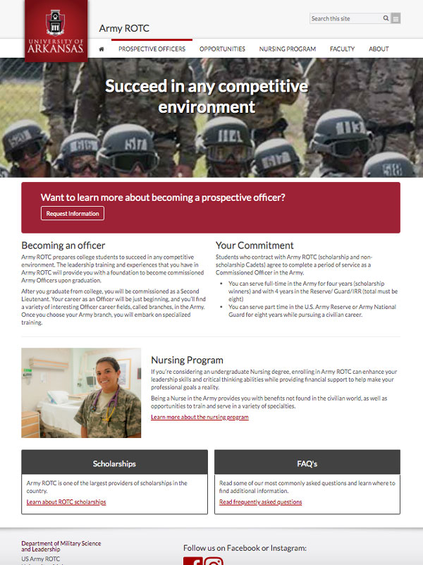
Secondary full width landing page
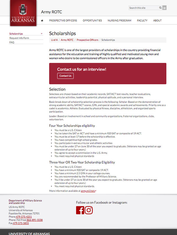
Tertiary interior page
Option 2
Full width home page and 2 column landing pages (top nav content) with left navigation (items in your left nav should be what you used in your dropdown menu previously). Left navigation may never duplicate top navigation.
To view the live site, please visit universityrelations.uark.edu
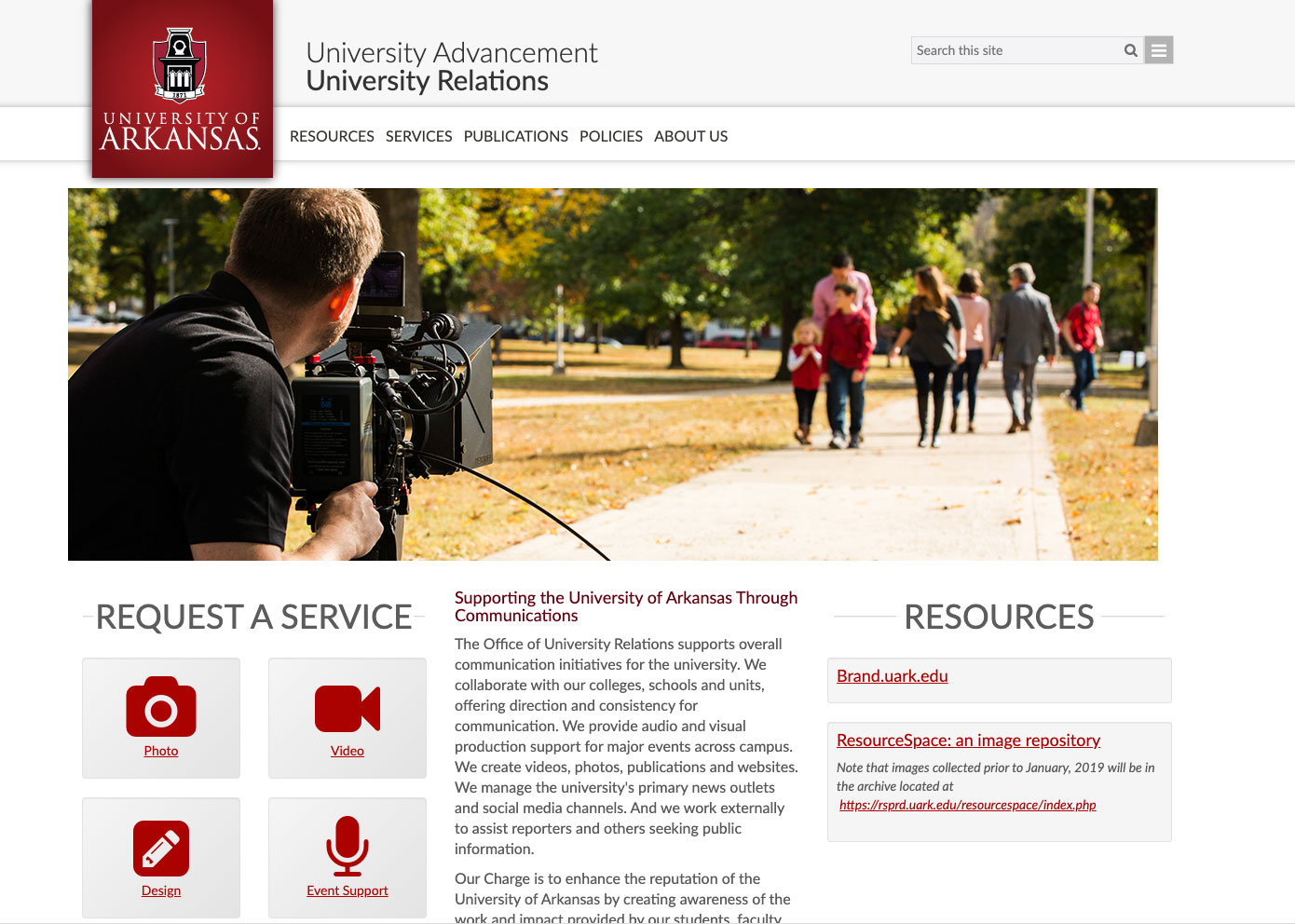
Full width home page
2 column landing page
Left Navigation
Never Duplicate Top Navigation
Left navigation should never duplicate top navigation
Use proper folder structure
Use proper folder structure so that left navigation functions properly as well as the breadcrumbs
No custom CSS
Do not put custom CSS in the left navigation, as it is not needed and affects the proper functioning/display of the left nav
Best Practice Guidelines
No External Links in Navigation
There should NEVER be external links (links taking users off of your website) in the navigation.
Always Include Home
Your top navigation should include a Home icon so users can navigate back using the menu.
Order of Navigation Items
Your navigation order should be determined by user priority and proximity. Typically, the first and last navigation items are often seen first by users (proximity) and the items in the middle second.
A good way to determine users priorities is to look at your site's analytics. Review what people are searching for on your site. Any navigation item that is at 5% or less is statistically irrellevant and you might consider lowering it's priority on the site.
If you are starting a new site from scratch, card sorting excercises and then basic tree testing can help determine labels and priority.
Number of Navigation Items
Always try and minimize the number of navigation items, but use informative names with good information scent to help the user. The rule of 7, or Miller's Law is optimal for navigation, especially for top navigation due to space restrictions- try and shoot for it.
Logical Breadcrumbs
Top level navigation files should all be in section folders for the breadcrumbs to work properly.
The first breadcrumb item will always be U of A. The second breadcrumb item should always match your current domain name (just like on this page).
Landing Page Funnels
Put navigation content on your landing pages to funnel users to deeper levels of the site. Never rely solely on site navigation.
About your About Section
Users expect certain content when it is presented under this general label:
- Contact Information- if this is not already it's own navigation item or in your pre-footer (pre-footer is preferred)
- Mission and Vision statements
- History
- "feel good" content- think of this space as a simple, more intimate place for your user to visit to find out what they otherwise might not know about you.