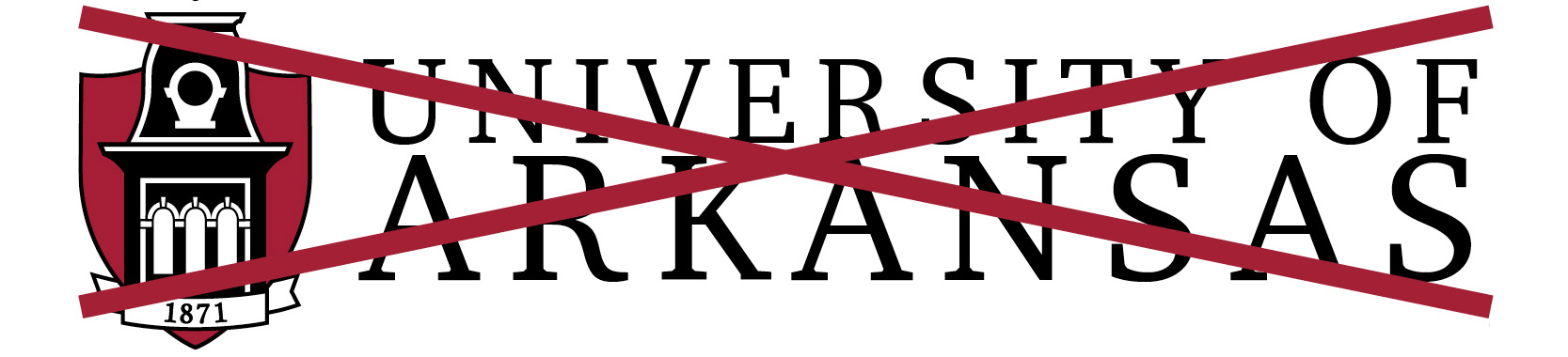
Examples of What Not to Do
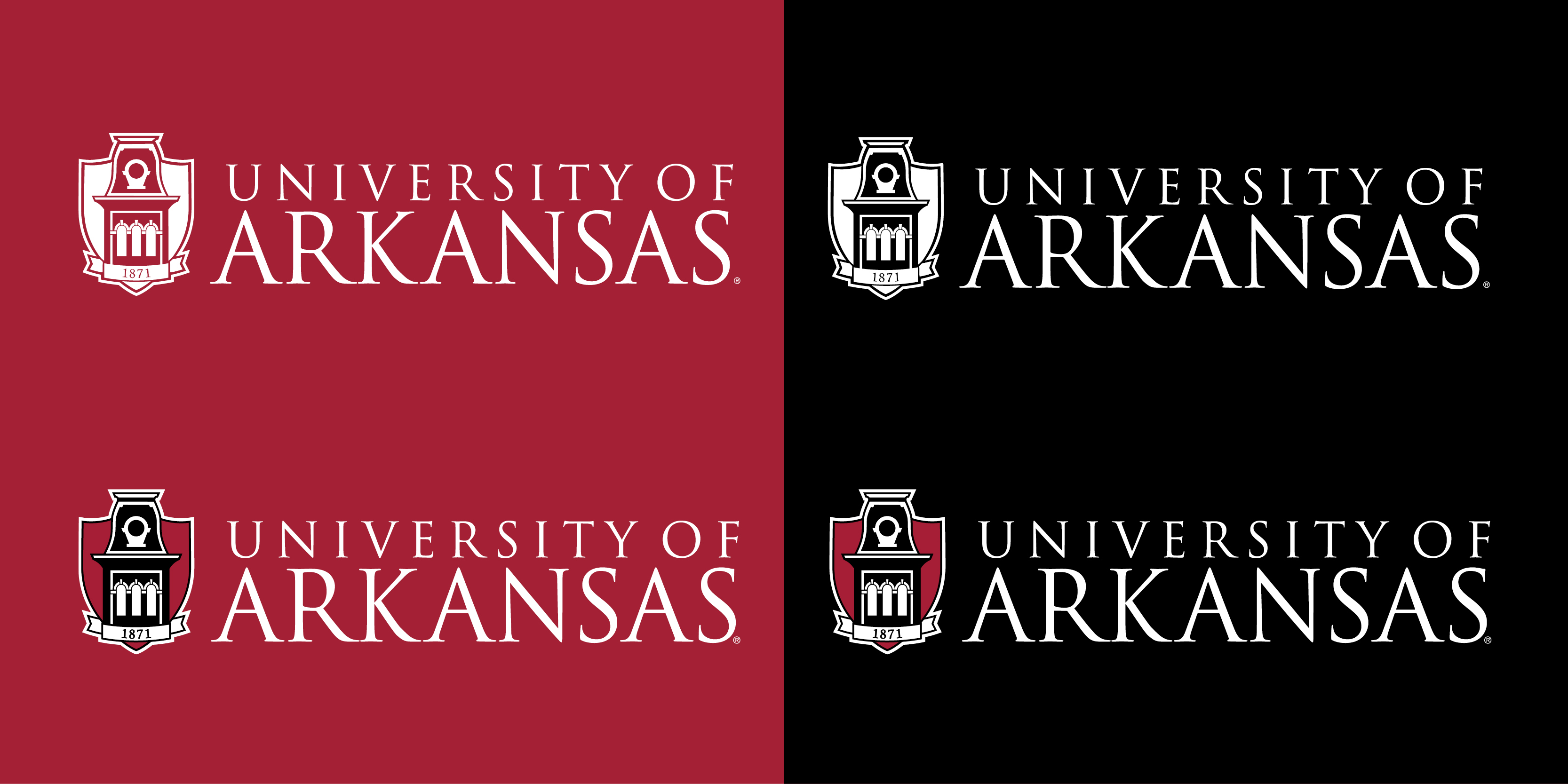
Improperly altering the logo to run on a dark background is the most common mistake made with the UA logo. Below is an example of correctly reversed logos. Note that the tower is always darker than the shield.
The top two logos show WHITE INK on DARK BACKGROUND reversal. In situations where you have a dark background and only a single color of ink available, you will want to use WHITE INK. These are examples of correct reversals in that situation.
The bottom two logos are correctly reversed two color logos, for situations when you have at least two colors of ink available for use.
For other situations, please contact university relations.
Following are examples of inappropriate usage of identity elements. When there is a question, please contact university relations at (479) 575-5555 or urelinfo@uark.edu.
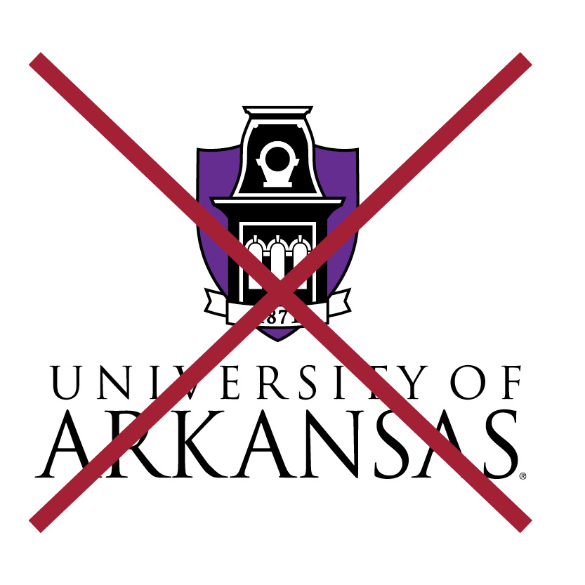 |
Do not use unofficial colors. |
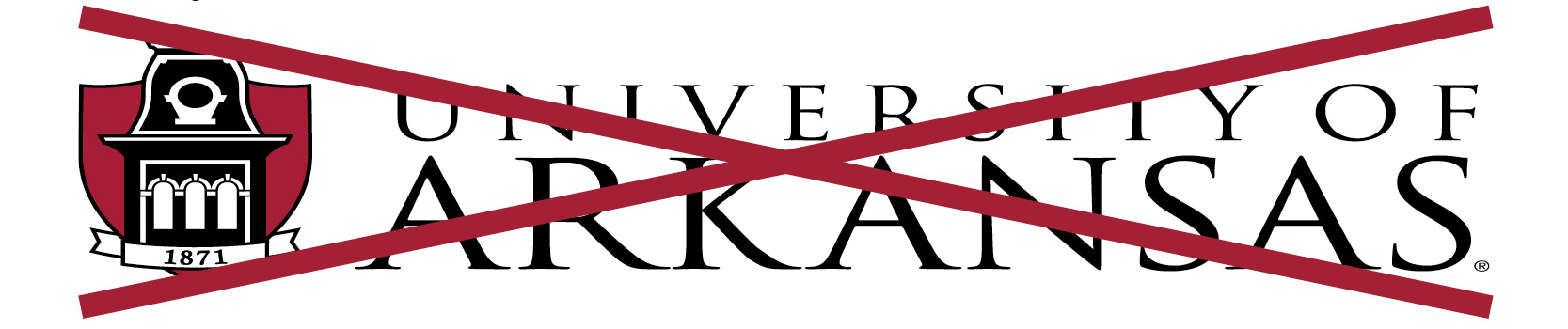 |
Do not sqeeze or stretch the logo. Always scale it propotionally. |
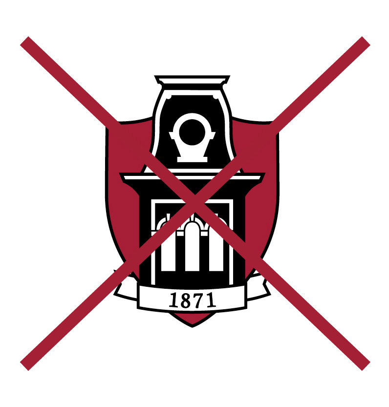 |
Do not use the shield or wordmark alone. Both elements should always appear together. |
 |
Never alter the wordmark or any visual elements, and do not change the font of the wordmark or accompanying names of colleges or divisions. |
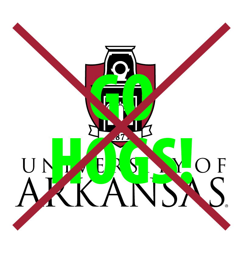 |
Never overprint something on top of the logo, and do not use the logo as a background pattern. |
The minimum recommended size for the standard logo is 1" in height. The minimum recommended size for the horizontal logo treatment is 1/2" in height.