Tips for Selecting Great Images
It is important to use high quality photography for all university websites. Full color images are preferred, although black and white may be allowed for historic images.
Choose your images carefully and remember that more is not better. Avoid using huge images that take up prime real estate on your website without adding value. Do not use photos to fill up space. When in doubt, remember that if there’s no content to go with that photo, it’s probably not adding value to your page and could be a distraction or cause too much scrolling for the user to access the real content.
Avoid using a photo rotator on your website unless you have a piece of content for every photo (minimum of four, maximum of six). If there’s no content to go to when the image is clicked, there’s no value added. Since you know your audience, you know they’re most likely not visiting your site to browse photos, so use them for accent—sparingly and in manageable sizes.
Another rule of thumb for photo rotators or slideshows: If you do not plan to regularly update the photos and their associated content—don’t use a rotator. Users will learn to tune this area out as they feel they’ve “already seen it” and stop looking there for new content, rendering it useless anyway.
Remember that content is king! Photos are for adding visual interest, but can become stale and boring quickly when users see the same photos over and over again. Worse, they can become a distraction and a barrier to your content if a user is frustrated at having to wait too long for the browser to load too many images or images that are too large. This can lead to user frustration and page abandonment.
Maximum file size is 1 MB, optimized for the Web.
Guidance – Selecting Images for Websites
The following guidance offers examples of ways to effectively use images on a website. While these examples are not exhaustive, they are intended to suggest qualities that make images compelling, appropriate, and useful.
Social/Informal Group
There are plenty of use cases in which a photo of a social or informal group makes sense. Images selected in these cases should be easy to interpret and should give viewers a sense of being included or present in the photo.

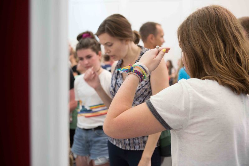
The photo above is an example of a less effective social/informal group image. The distance and angle of the photo doesn’t allow us to see most of the subjects’ faces clearly, which makes the photo feel generic and less engaging. It’s not clear what moment the photo is capturing, and viewers will have a harder time connecting the photograph with the remaining content on the page.
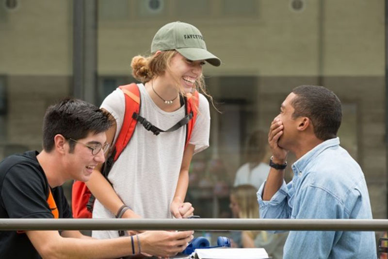
The photo above is a good example of an effective social/informal group image. The photo makes effective use of distance. The shot is just close enough that we can see the subjects’ expressions, which gives the image a clear mood. The image also captures a genuine moment between students – a quality that makes the image compelling on sites addressing prospective students (and their parents), potential faculty members, and potential donors.
Speaker
There are often times in which it makes sense to include an image of a presenter or speaker, especially when reporting about special events, classes, or other gatherings on campus.

The photo above is poorly lit and does not offer a clear view of the speaker. It also fails to capture the spirit of the moment – it’s not immediately clear to the viewer the mood of the scene. The distant framing also allows for a distracting background.

The photo above is a good example of an effective presenter/speaker shot. The photo composition offers users a clear, well-lit view of the speaker, and it captures an uplifting, compelling moment for the speaker and everyone in the photo. Additionally, the close perspective minimizes visual noise in the image.
Student/Faculty Event
Many webpages need to feature images of on-campus, student events. Such images should be framed whenever possible to capture a genuine moment shared between students, students and faculty, etc.
The photo above doesn’t offer a clear focal point. It provides no clear information about what’s happening in the scene, and it also makes it unclear who is intended to be the primary subject.
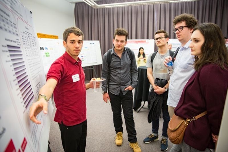
The photo above makes good use of angles to impart a sense of motion or action even though the subjects are still. In showing part of the poster, the image also conveys more information about the overall context. Users can easily tell what’s happening in the scene.
Other Examples
Portrait/Headshot - Exemplar

This photo is a bad example in that it is not well-lit from the front, the crop angle is odd, the subject is not looking into the camera and street debris can be seen behind him. This image would be out of place amongst others shot and cropped properly.

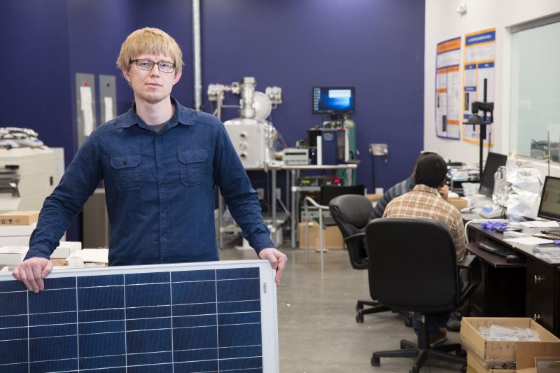
This photo is well-lit, and makes good use of distance to include not only the subject’s upper body but enough of her surroundings to give clues about her field of study before the viewer reads a caption. While the foreground is informative (equipment), the background is neutral enough to not distract. The slight angle of her head and upper body also creates a more interesting line than a typical portrait.
Environmental Shots - Exemplar
This photo attempts to highlight the tech but unfortunately it is from a straightforward angle so the item looks like a large, eye-catching square. The expression from the main subjects face is unwelcoming and there is really nothing interesting drawing your eyes in. The foreground is flat and the background is unwelcoming and the secondary subjects faces are hidden making you wonder what is going on.
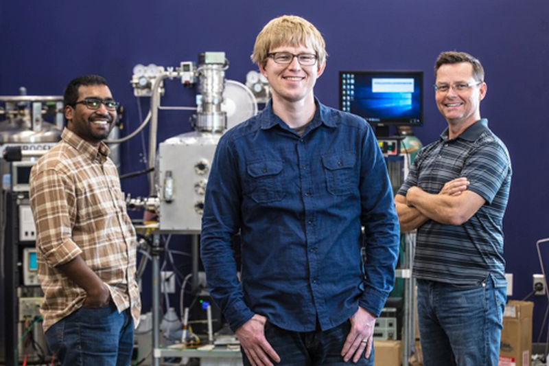
This photo not only highlights the foreground well but also highlights the middle ground and background in a triangle without making the image too busy. All of the subjects have positive expressions and the main subject is placed well leading your focus. The tech is incorporated well into the image but not overshadowing. The subjects and tech are casual with a natural feel.
Large Campus Events - Negatives
There are often reasons to include photos of large on-campus events on departmental websites. When selecting photos of large events, keep in mind that clear, easy to interpret details are often more compelling than distant group shots. These are both examples of less effective event photos.

The photo above fails to offer any clear detail, and the flash creates an awkwardly-placed hot spot which highlights the table cloth more than it does the people.
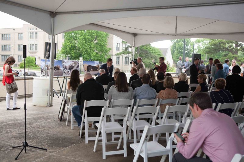
The photo above is well-lit, but taken from too far away and from a poor angle – all we see are the backs of several heads. There is no clear focal point, and the distant shot invites a lot of distraction.
Suggestions for selecting effective photos:
- For photos of people, look for clear views of faces that convey emotions. Unless the goal is solely to give an idea of attendance, a closer photo of one or a few faces is more evocative than a photo of several people from further away.
- Select photos that have a clear primary subject. This doesn’t have to be in the center of the image. As the examples show, lighting, color and depth of field can guide the eye. Look for photos that have an unmistakable focal point.
- If taking a photo with a phone camera, you may have better results taking the photo without zoom and cropping.
- If you’re charged with photographing an event (and you can’t arrange for a photographer from UREL to attend your event) take as many photos as you can, especially of candid moments or interactions. The best shot may not be one you can plan for.
- When cropping any photo for general use, consider leaving some neutral space for text overlays.
- Always work to select the photo that makes the most sense with the remaining content on your page.